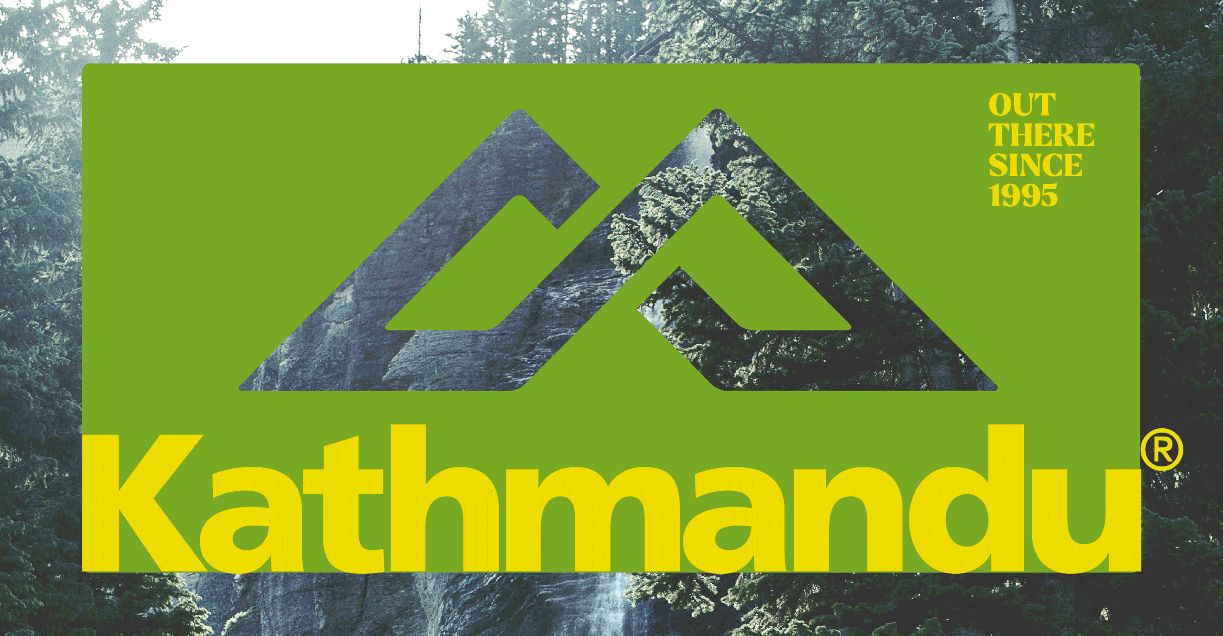
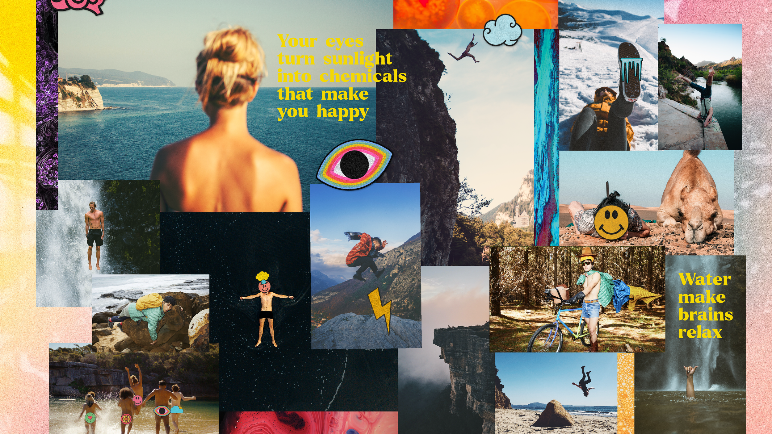
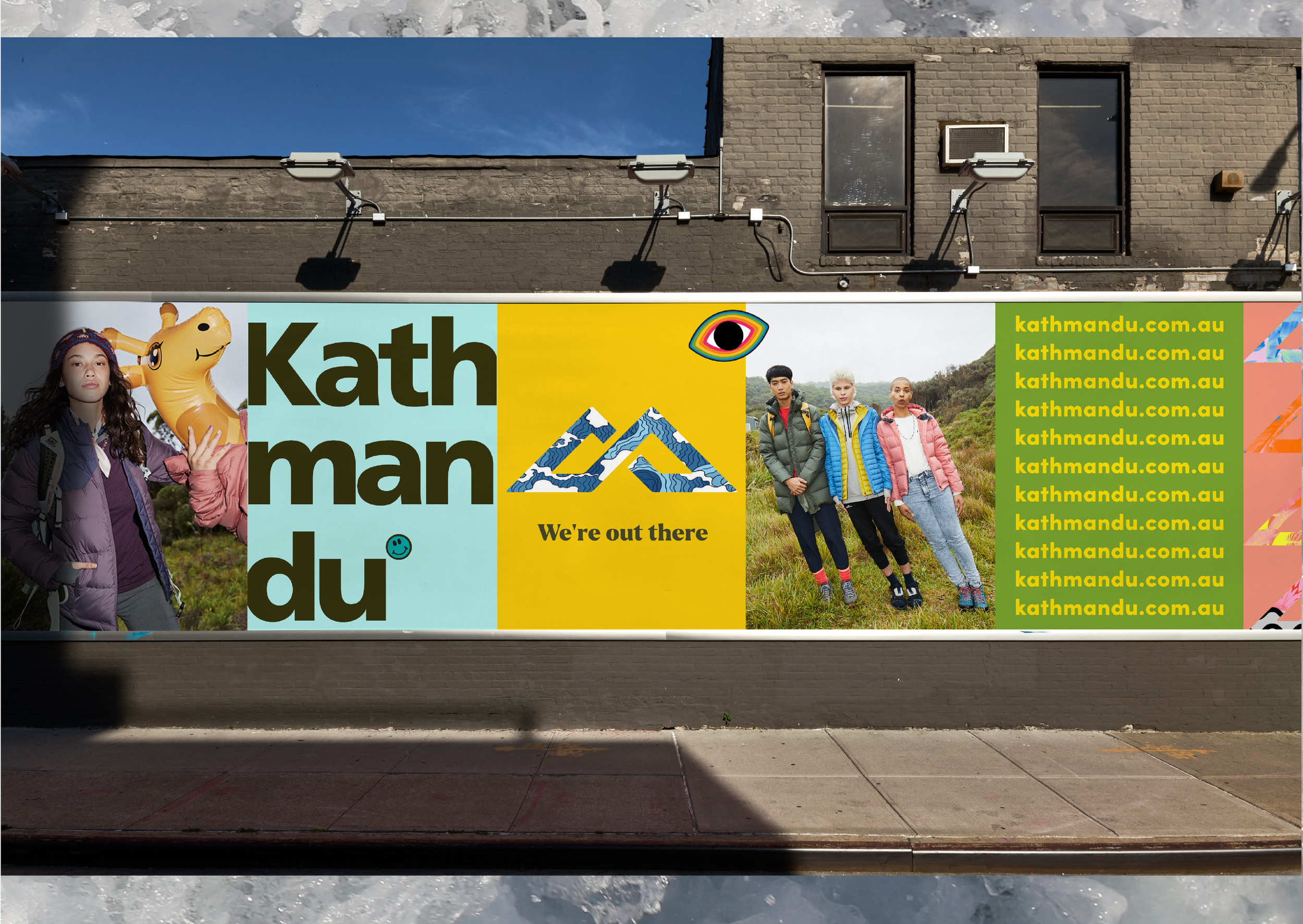
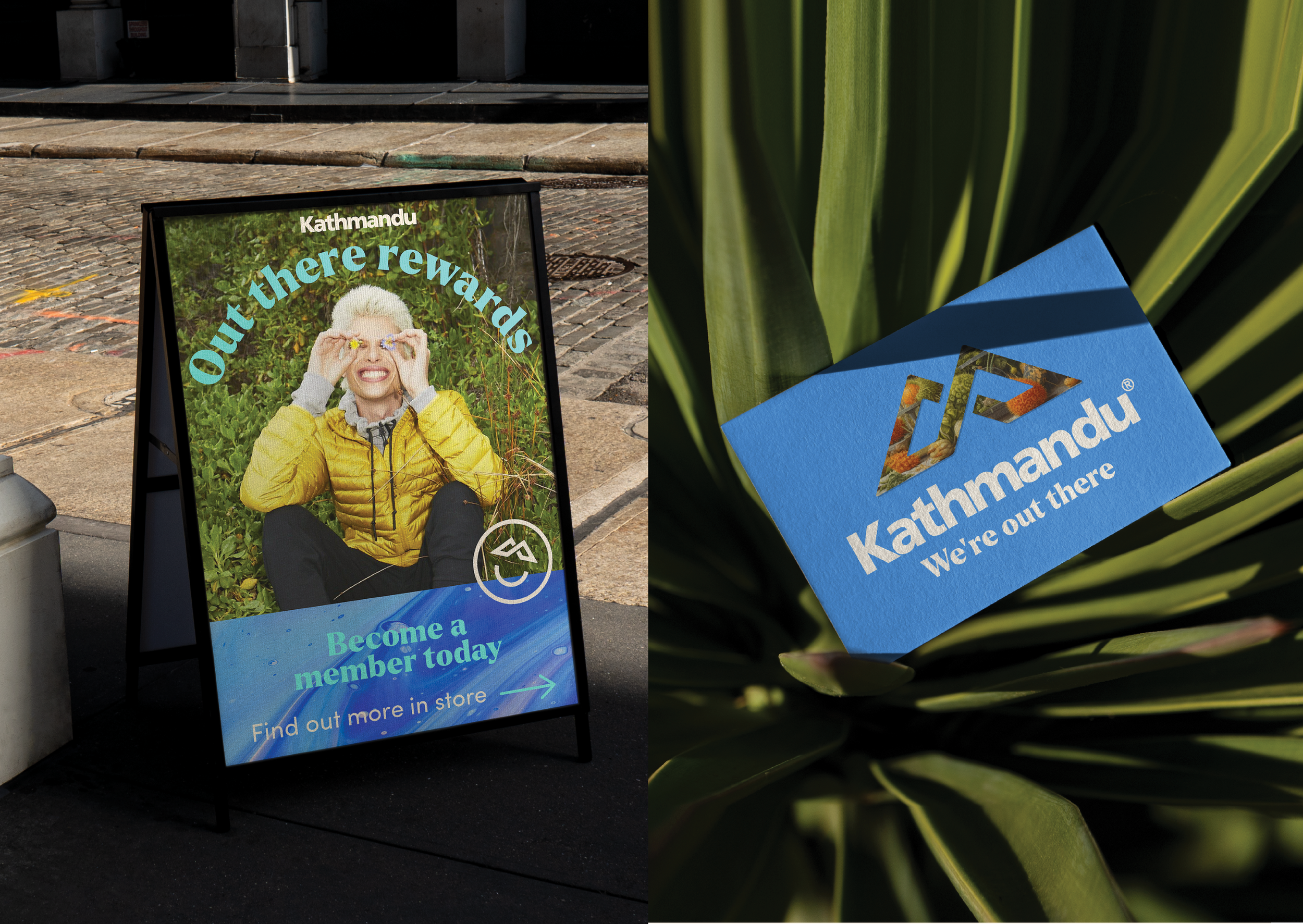
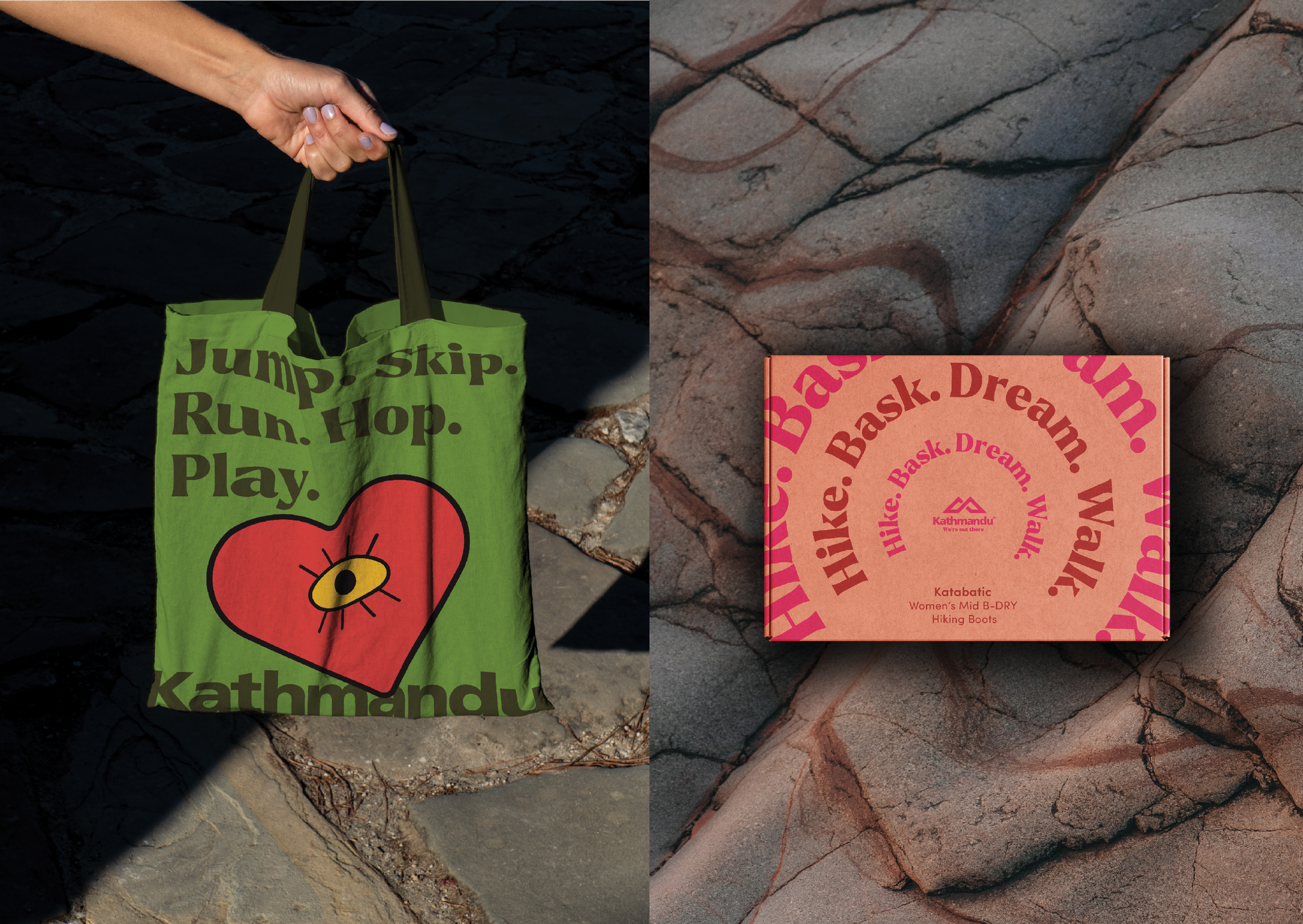
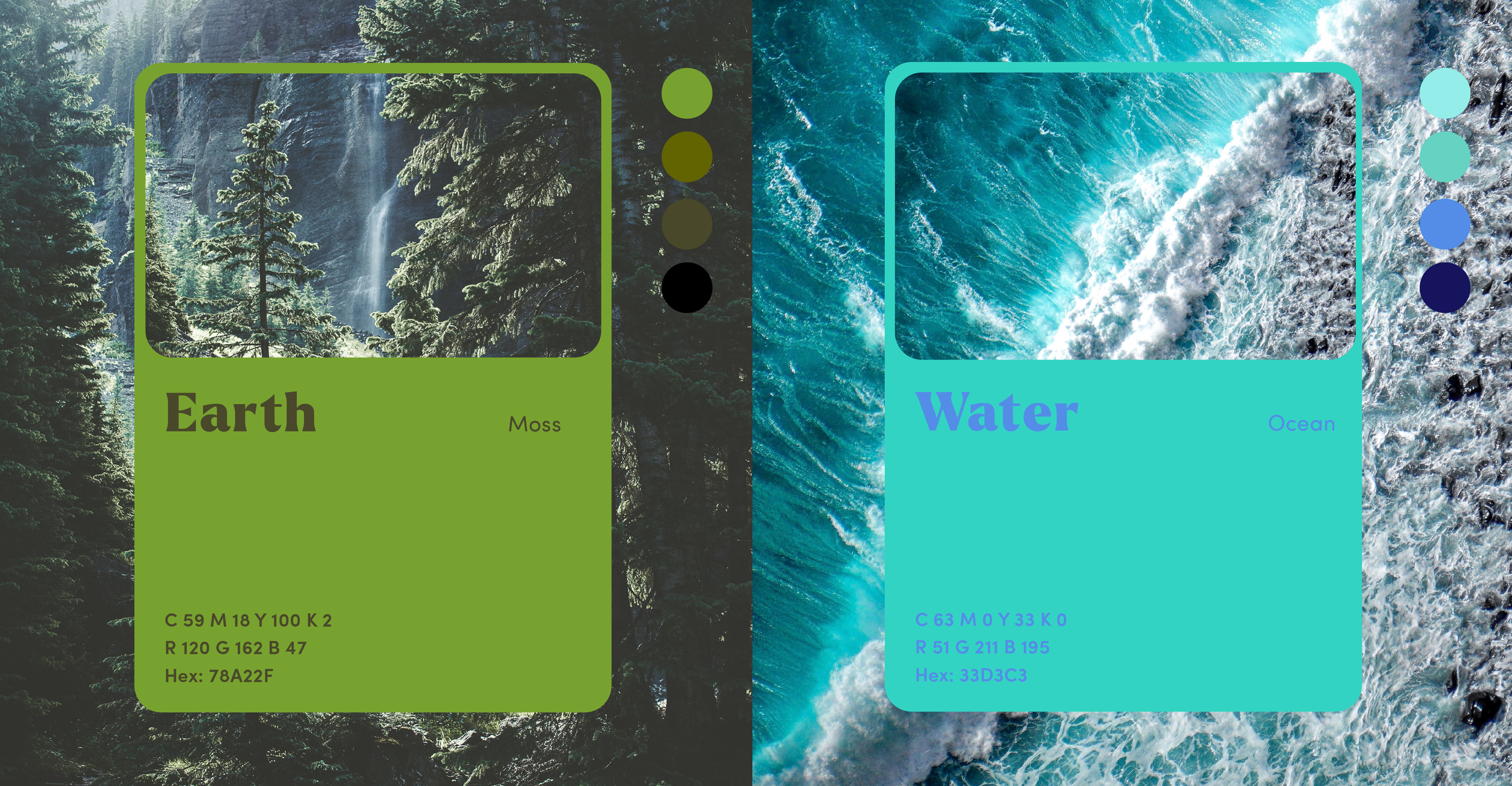
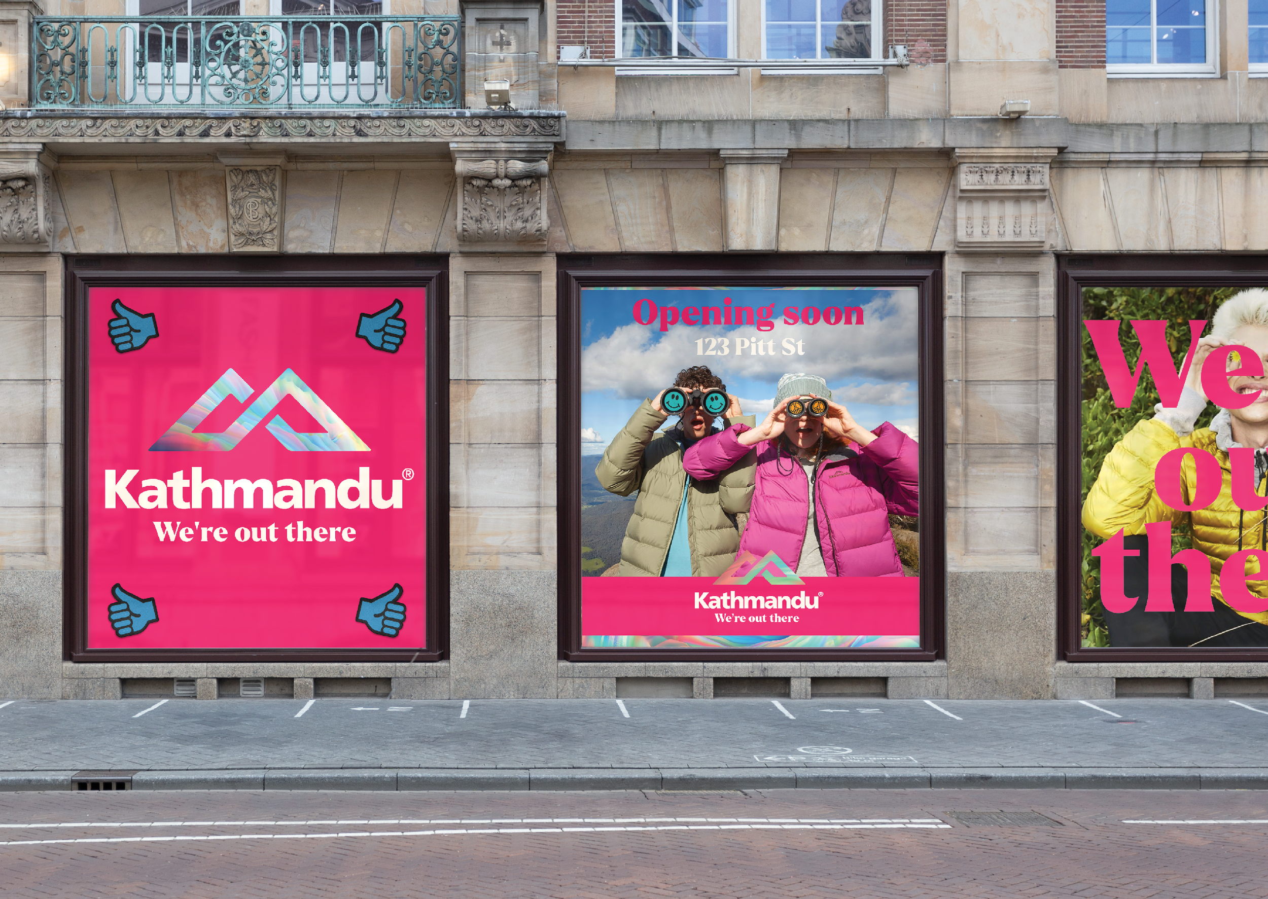
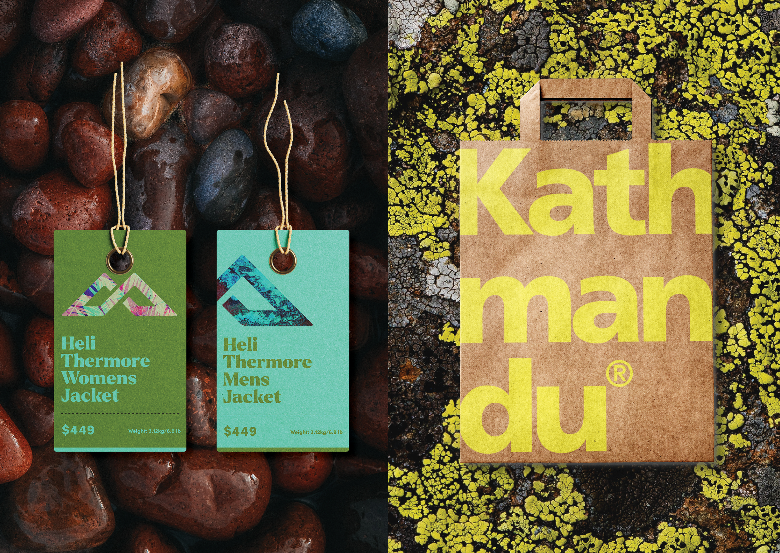
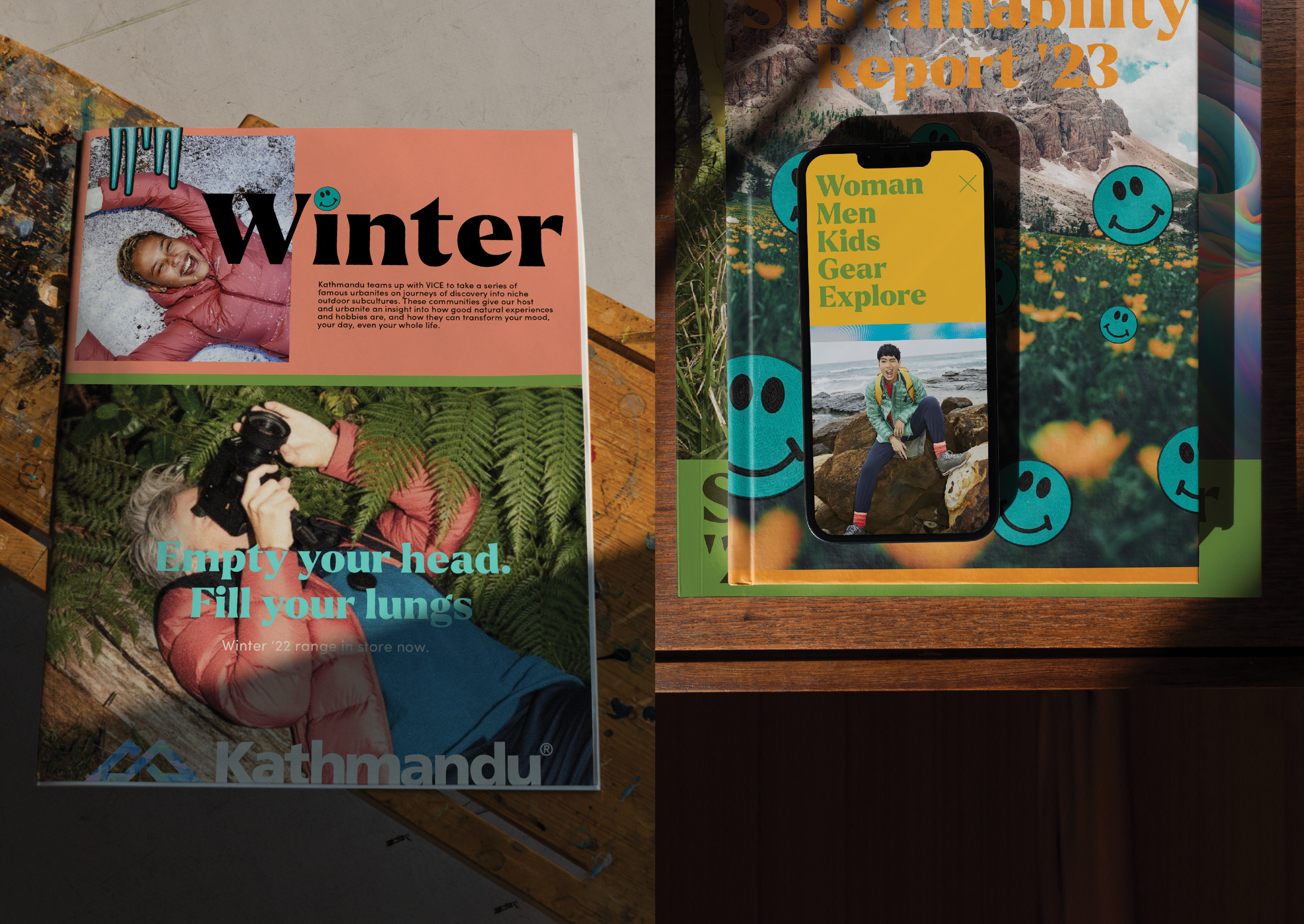
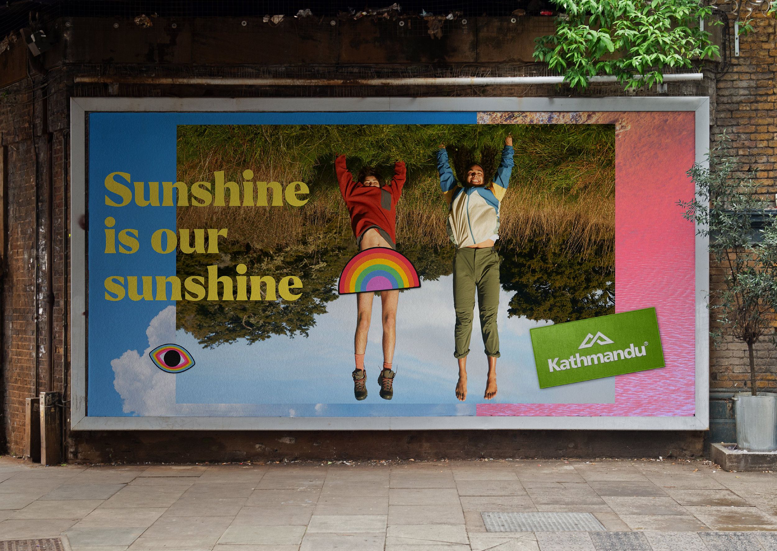
We revitalized a previously functional brand, infusing it with bold, nature-inspired vibrancy that illustrates the profound physiological benefits of time spent in nature. Research shows that time outdoors reduces stress, enhances empathy, elevates happiness, and boosts creativity. This scientific insight guided the development of a fresh brand platform—"We’re Out There"—which shaped each element of a dynamic, joy-filled brand transformation. Gone were conservative, conventional designs; in their place emerged a vibrant, nature-inspired identity brimming with bold color and energy. The iconic Kathmandu twin peak logo was reimagined with vivid natural cues, introducing depth and adjusting proportions to create stronger visual impact. To reflect the rich diversity of the natural world, we broadened Kathmandu’s color palette, pairing it with a typography style that embodies our new, "out there" brand ethos.